You’re hot and you’re cold
I have entered many rooms in houses, stores and restaurants that consist of either all warm or all cool colors. They make me yawn. When everything is the same, nothing catches your eye or provokes interest. I don’t want you to make this mistake on your next room remodel, so here is a quick lesson on color schemes and color temperatures:
Perhaps you remember from your elementary school days that there are primary (red, blue and yellow), secondary (orange, green and violet) and tertiary colors. You may have also learned about the color wheel, specifically, the Brewster/Prang color wheel:

A color scheme can be chosen using this color wheel as a visual guide. There are a number of color schemes: monochromatic, analogous, complementary, split complementary, triad, tetrad, and square. Is your head spinning yet? No need to google the definitions of all of them, because we are just going to focus on the complementary color scheme.
A complementary color scheme refers to choosing two colors on the color wheel that sit opposite each other. When looking at the color wheel, blue and orange are complementary. Red and green are complementary. Yellow and violet are complementary. Make sense? As an example, let’s choose blue and orange as our complementary color scheme to furnish our living room.
Have you heard of anyone describing a room in warm tones? This refers to the color temperature. Check out the wheel again… the warm colors are on the north and east sides of the color wheel (red, orange and yellow). Warm colors are typically associated with high energy, stimulation and comfort. I think of warm colors of autumn: reds, oranges, yellows, browns, golds and muted greens. The cool colors are on the west and south sides of the color wheel (violet, blue and green). Cool colors are associated with calm, clean and fresh spaces. I think of cool colors of spring: blues, purples, pinks, and vibrant greens. For our example, orange is warm and blue is cool.
I like the complementary color scheme, because it forces you to choose both a warm color and a cool color, since they are on opposite sides of the color wheel.
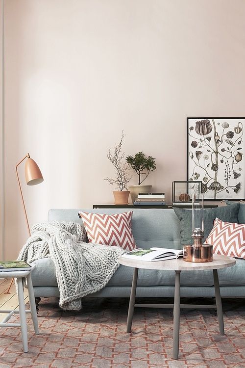
Now, let’s apply the blue and orange colors into a room. Start with an off-white, or a light, neutral (neither cool nor warm) paint color. Next, choose fabrics and finishes for the furniture and rug in various shades of blue and orange. Don’t forget that an orange piece can include a table with a natural cherry wood finish or a leather chair. Finally, add accent colors in more vibrant shades of orange and blue (pillows, vases, objects, etc.), but don’t go crazy… keep it edited. Include neutrals to balance out the space.
Here is a living room with a blue and orange scheme that I designed for my Brown Road project:

Michigan vacation home
You can also check out the blue and orange scheme for my Edgewater Road project:

Master bedroom; bed linens from West Elm
Refer to my pins from Pinterest living board below (left pic illustrates a muted color palette and the right pic is more vibrant ):

Good luck using color schemes and temperatures for your next project. As always, I suggest that you hire a design professional to help you with all of the details.
